
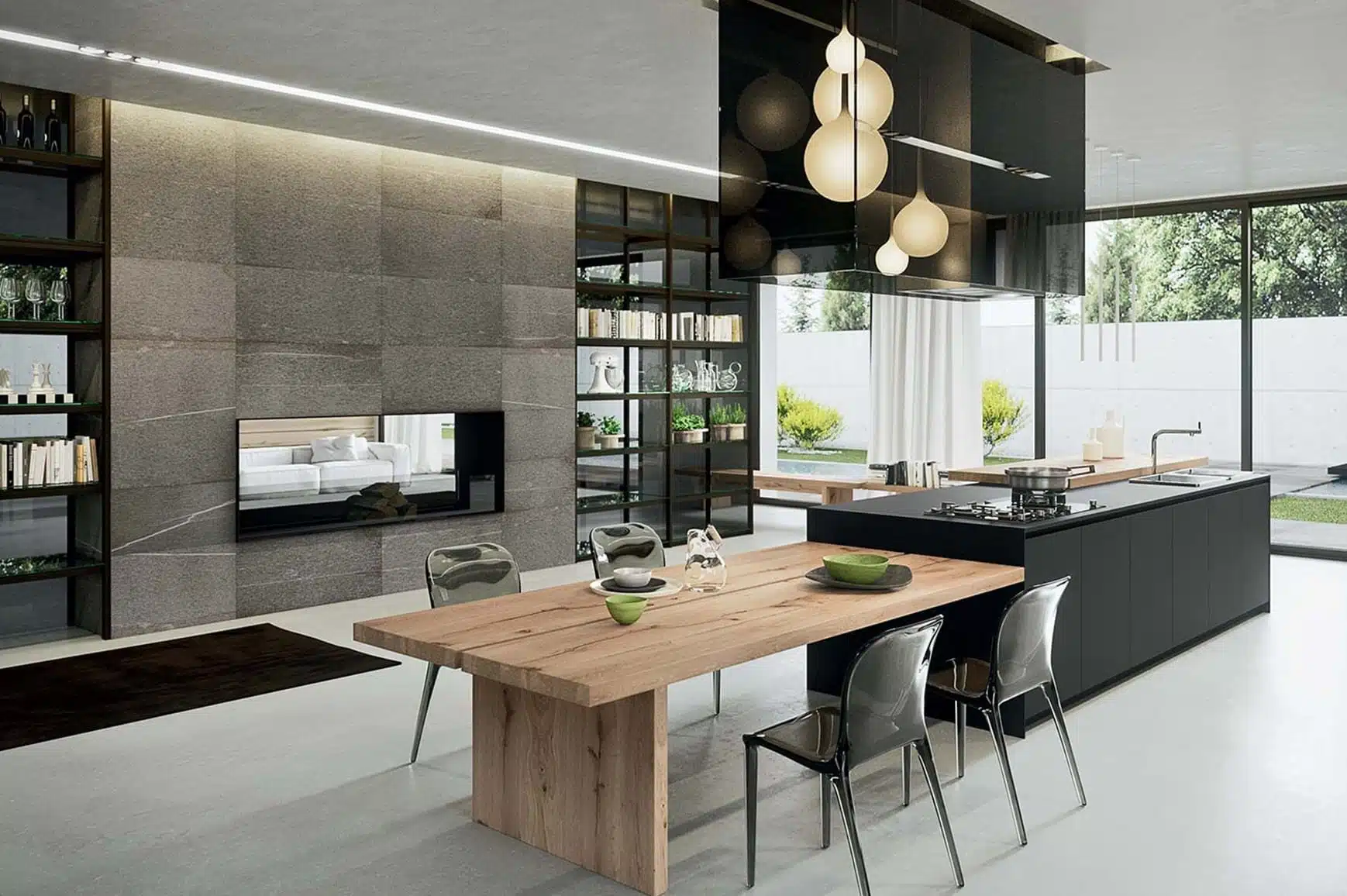
In the realm of interior design, the usage of colours wields a profound influence and has the power to transform spaces, directly impacting the personality and mood of any room. Whether seeking a relaxing living space, a productive office environment, or a space which resonates sophistication and elegance, a strategic selection of harmonious colours will play a primary role in the evoking of emotions, and the enhancing of ambience.
In this blog post, we will explore how colours impact interior design, timeless colour combinations to evoke an emotional connection, the psychological impact of colours, and tips and tricks which can be used to ensure a harmonious paring of colours for your next interior design project.
Colour Combinations
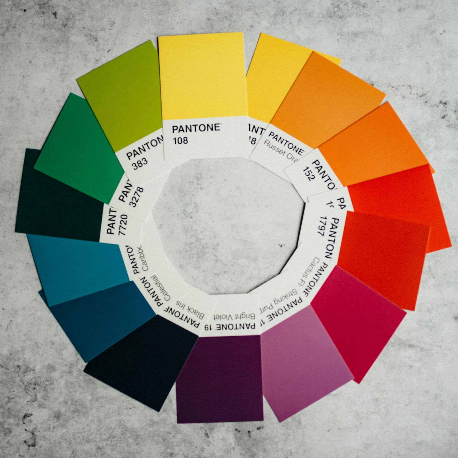
Colour combinations are one of the most important factors to consider when designing a room. However, understanding how each colour evokes certain emotions comes second to creating a visually appealing space. There are several colour combination techniques which can be used. For each of the examples below, we have used Adobe’s colour wheel tool to demonstrate colour wheel interior design.
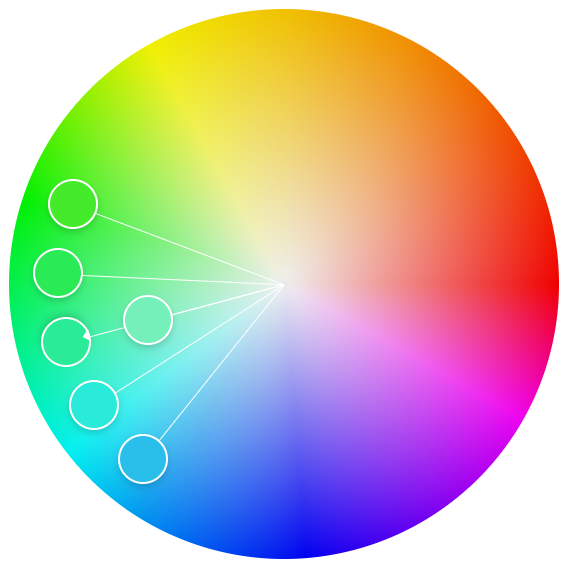
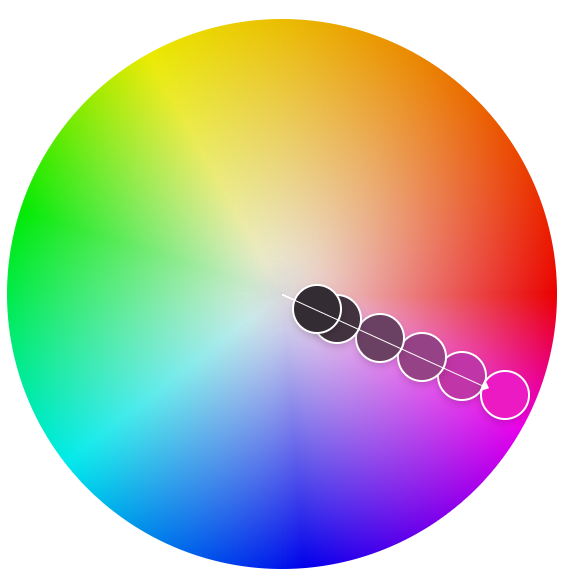
- Analogous colours – Analogous colours create harmony by blending colours which are adjacent to each other on the colour wheel. For example, by combining shades of a given colour to evoke cohesion.
- Complementary Colours – Often used for creating a dynamic contrast, complementary colours are often direct opposites on the colour wheel, and can be visually impactful owing to the juxtaposition between the two colours.
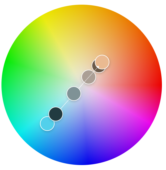
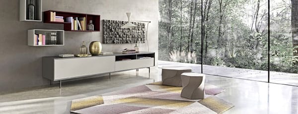
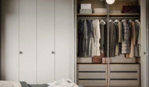
- Monochromatic Scheme – these shades are formed from a primary colour. They can often help form depth, whilst offering the benefits of being versatile and allowing for a smooth transition between areas of a room which should be of higher or lower visual importance, i.e., using more prominent shades to define items such as a feature wall.
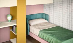
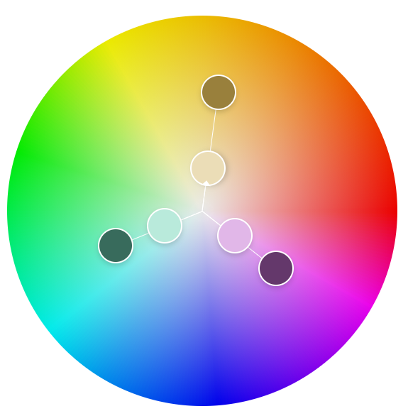
- Triadic Colours -this colour technique is often perfect for those wanting to achieve a multifaceted room, fulfilling many purposes, e.g. a living room designed with both conform and productivity in mind. These colours are evenly spaced to allow for a neutral balance, which can help evoke a variety of emotions simultaneously.
Colour Psychology In Interior Design – Understanding The Impact
Each colour evokes a specific emotion, and depending on the setting, this can be positive or negative. As a stark contrast to interior design, motion pictures have been using deeper and darker colours to convey a more serious tone, or suspense since the 2000s, and interior designers have also used this to great success to create both serenity and tranquillity.
- Red: a stark symbol of passion and vitality, often stimulates the senses and fosters conversation; this can also be used to add warmth and intensity to the environment.
- Blue: often evokes feelings of calmness and serenity; this colour is often used to promote relaxation, with studies showing that the inclusion of blue in areas such as offices or bedrooms has a positive effect on mood and productivity.
- Yellow: this colour radiates both optimism and positivity, creating a welcoming and bright environment, perfect for social thriving. This colour has been used in both kitchens and living rooms to increase mood and promote cheeriness.
- Green: the stunning symbol of nature and renewal. The usage of greens has often been used to promote harmony and balance, often accomplished with the use of plants and foliage. The usage of this colour in bedrooms, offices, and other spaces of relaxation or productivity helps to evoke a sense of tranquillity.
- Purple: famed for its use as a symbol of luxury and creativity, incorporating purposes encourages introspection and imagination. When looking for an accent shade to add elegance to a room, purple often shines through, bringing the required depth and sophistication to the interior decor.
The Importance of Colours in Interior Design
As explained above, colours evoke emotions, and using these colours successfully can have the biggest impact when inviting friends, family, or guests into your home. When designing a room, it is critical to remember why colours play such a key role in forming the ambience of an environment:
- Colours set the mood – colours influence emotions and perceptions, and paired with natural light can be the instant determiner of someone’s experiences in your home.
- Highlighting visual interest – as explained above, using a monochromatic colour scheme to draw attention to specific details can help shape a guest’s visual journey.
- Personal reflection – one key fact to remember is that a room isn’t just part of your home, it is a direct reflection of your personality, tastes, and likes. This can help better inform your guests of your unique tastes, personality and interests.
Tips and tricks when using colour in interior design
- Consider the usage of natural light, by accounting for how well-lit a room is naturally, you can help shape the perception of a room. For example, a well-lit room containing a lot of reds will be seen as luxurious, and evoke vitality; in stark contrast, a darkly lit room will be seen as evoking passion and intimacy.
- Always start small before committing to a colour scheme; experimenting with colours through the use of accent walls, furnishings and accessories will help create a foundation, and better inform commitment to a particular colour scheme.
- The usage of textures and finishes which either contrast or complement your colour scheme will add intrigue, and depth and infuse personality into your design.
Creating Your Perfect Home
As well as our wide range of products, from prestigious Italian designers like Bonaldo & Cattelan Italia, we also take the hard work out of finding the perfect colours for your home through our interior design services, covering every room in the house, ensuring you achieve the perfect result from your renovation.